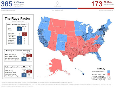
 This second map (above) was created in order to visualize more information concerning the 2008 election. I found some interesting exit poll statistics on CNN, which showed that the majority of White Americans preferred McCain to Obama, not limited by gender, income, or education level; consequently, I decided to map population density of "Non-Whites" by state. I combined Blacks, Hispanics, and Asians in order to keep the map simple and easy to read. The following were considered swing states during the 2008 election and are accompanied by the number of contributing electoral votes in parentheses:
- Nevada (5)
- Colorado (9)
- New Mexico (5)
- Iowa (7)
- Missouri (11)
- Mnnesota (10)
- Ohio (20)
- Virginia (13)
- Florida (27)
- New Hampshire (4)
The map itself attempts to build upon the NY times map by making more use of the empty space while simultaneously displaying additional data concerning the 2008 election within a geospatial scale. Colors and Map Key were altered to better fit the purpose of the map.


No comments:
Post a Comment